Wednesday, August 1, 2018

52!!!!

Wow!!

Here it is, the last of a year's worth of Weekly Warped Squares. It took a little over a year, but we made it!

I chose the Primer (Plus) colorway for this one, because it definitely surprised me the most this year, by becoming my favorite. I have long had a semi-obsession with subtle blends (witness all those gray and silver squares!), and when confronted with these primary tones I just didn't know what I could do with them. But I think these colors, both all together and used in smaller groups, made the most striking squares of the collection. 
And Peep Show!! Clear beads definitely have a place in my stash forevermore.

The addition of Sour Puss to the Primer set is the icing on the cake.

Thank you to all the beaders who continue to visit the blog. As I type, there have been nearly 28,000 views!!  Interestingly, there's only one subscriber. An extra big thank you to YOU! And to the beaders who have commented and visited me at events to let me know they have enjoyed the blog and made the squares. It means a lot to me that you took the time to say hello.

I don't intend to abandon the blog completely. I'm sure there will be more squares, and I'll share info about upcoming events. I will be leading a WS class in Truckee, CA on August 25!

Not sure if I'll propose another WSWorkshop for the Bead&Button Show, or create a packet for 2019. Time will tell, and I'll share it here and on FB and Instagram if I do.

So anyway, here's the pattern!

Size 11 Delica beads; basic threadpath HERE.


Wednesday, July 25, 2018

51

Okay, first of all: That Darn Cat!

Clio for some reason was all over me while I tried to work today. I think she wanted to go outside, but the guys working on our house go in and out of her enclosure a lot and I'm concerned she will get out. Plus, we have had a lot of rain the last few days, so it's muddy. Seems fair enough to me, but she wants what she wants, and kept getting in my face while I tried to design the square, and then, I swear, she was putting her paw on the thread while I worked. Removing the thread was judged a serious offense--Mrow Mrow!


I made her pose for pictures afterward, since I figured how much more crabby could she get? I wish I had audio here, because boy did she get CRABBY!

Fortunately, it's a pretty simple, summery square this week. I was inspired by these insane lilies that get 5 feet tall. I ride my bike past a house that has them in the garden. I'm determined to plant some next year, but for now, it's just a square.

Notice there's no edging!

In the pattern I have suggested Ares, light bronze, but black might be a striking way to suggest those irresistible lily freckles!

Made with size 11 Delica beads; the basic WS threadpath can be viewed HERE.


Wednesday, July 18, 2018

50!!!

Wow, FIFTY squares.

While fifty-two is my goal, there's just something about that nice round number.

So I made something pretty to celebrate! I was kind of surprised to realize that I hadn't done this variation of a bacon stripe before...now that I look at the photo I kind of wish I had drawn both ends of each stripe out to the edge...I added the outside rounds of clear on impulse and my thinking didn't get that far. Oh well, I like it anyway!

Made with size 11 Delica beads; basic Warped Square threadpath can be viewed HERE.

Two more to go!


Wednesday, July 11, 2018

49!!

Well, this is a first --I'm  writing this post on my phone! It's been a busy day, and at the last minute I'm out on an errand. Luckily I have a bit of a wait and a good data plan.

This week's square is pretty sweet, candy - colored stripes creating a love knot on a strong graphic background. I like it and think I have an idea for a variation or two.

Oh dang! I didn't have time to take a photo before I left. Well here's hoping I will get home tonight in time to take a picture and edit it.

**10:06am, PST
Here's the photo--


Anyway, here's the square, as usual made of size 11 Delicas, edged with size 15 seed beads.

Wednesday, July 4, 2018

48--the final push!

Ok here we go, I am back and ready to round out a year's worth of squares. I feel sad that I wasn't able to do them all consecutively, but them's the breaks.

I bet you didn't know that while all y'all are getting your blog fix on Wednesday mornings, I am soaking up the rainbows in my favorite yoga class with the marvelous Yoga Mama Gina Quincy. I have learned so much from her in the past year and I am very grateful for her loving spirit.

Her birthday was a couple of weeks ago, and this will be a pair of earrings for her. Thank you Gina!!

The rainbow progression looks wonderful punctuated with clear Peep Show. I used white thread for this one, but I think other colors would be fun too. Like a sunny orange or yellow.

Beaded in size 11 Delicas, still working within the 'CGB palette'. Basic square threadpath can be found HERE

And the WS packet of patterns for 2018 is now available in a Digital Edition, with a limited quantity of paper patterns coming soon. This year's packet includes a fabulously sophisticated pair of earrings with 'exploding' instructions, and a trio of squares demonstrating different ways with strips using a progression of colors. I hope you enjoy them!

Oh, and HAPPY INDEPENDENCE DAY!!


Wednesday, May 16, 2018

47

So Close!!

We are just five squares away from a full year, how exciting! It's nerve-wracking too, as there is a whole lot going on here just now, culminating in the Bead&Button Show in 3 weeks. 3 WEEKS?!

I'll make this quick:
Working in my beloved tweeds the last couple of weeks gave me the idea of playing around with the arrangement of the colors. I wanted facing quadrants featuring a single color to blend along the sides. So here there are facing quadrants featuring green and lilac striped with neutrals, and then all four colors are blended along the sides. It's pretty, but maybe not as striking as it could be with stronger contrast. Notice that I chose to work the 4-color sides so that the green and purple create 'horizontal' bands leading toward the stripe ends.

As always, you can find the basic Warped Square threadpath HERE. These patterns are shown worked in size 11 Delica beads. Bead kits still on SALE!


Wednesday, May 9, 2018

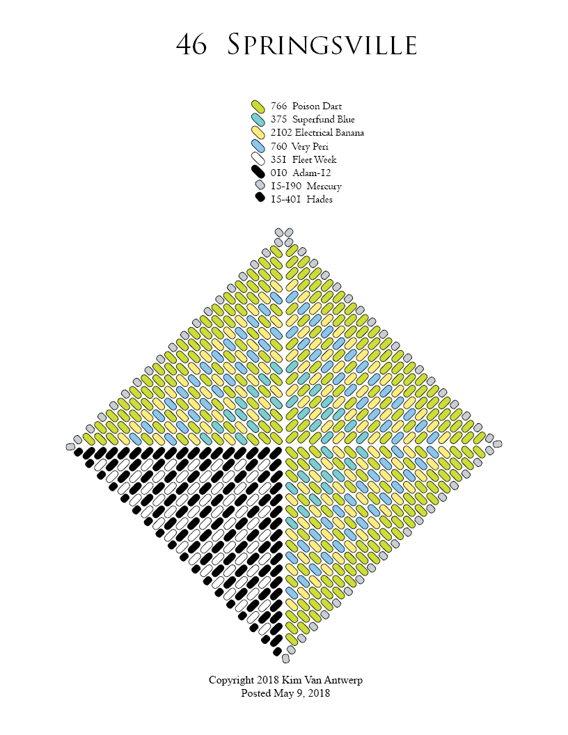
46

Yes, more sunshine and green green green:

I have never enjoyed springtime so much as I do here at Lake Tahoe; our garden is looking lovely, the birds and animals are romping around, and the air is just heavenly. 

But this square is really more about the concept than the colors of sun, sky and grass. In my bead box I ran across a stray triangle like the ones I made for my folding lotus bracelet:


I still really like the way those stripes line up when joined to create their own fields of pattern. They  blur the line between triangles and make you question what you are looking at. And I think the individual triangle look cool too, with their strong colors interrupted and kicked off balance with this bold graphic section. Looks good in a square, too! And of course the squares can be joined in various ways, including into stars and twisty ribbons!

Basic WS pattern is available HERE
And I still have bead kits available at half price in the shop. Right now I'm offering the 'Prism/Phoenix' and 'Primer/Temple Prime' kits. Each of these has been featured numerous times here in the blog and in CGB patterns like the Exploding Sets.


Wednesday, May 2, 2018

45

I'm not sure just what I had in mind as I started this week's square; I just thought it would be interesting to have the geometric shapes kind of spiral out in size...and then I forgot and made the blue and green ones the same width! So I stopped and took a deep breath and thought about what to do...
I had some reminders this week of earlier squares using this colorway (Primer/Temple Prime bead kit, still On Sale!), and remembered how effective it was to float the bright colors over a 'tweed' field.So I used that for a border and I'm really happy with it!

It reminds me of those sort of flag signs for railroads, hence the name.

Don't forget, the basic Warped Square threadpath can be found HERE, and bead kits are half price!

Wednesday, April 25, 2018

44

This week's square is a bit of a color study, using different combinations of yellow, blue, and green. While I worked on it, it felt like an expression of the many shades of green emerging in the early springtime. When it was finished it just reminded me of Wasabi Peas, yum!

And now I need a snack.
Enjoy!

Wednesday, April 18, 2018

43

So. It's spring.
I guess you may have noticed by now that I am a person who would delight in eight months of winter. But the fleeting nature of snow season is part of what makes it precious and special, so I am reconciled to having four seasons in the year.

We've had mild temperatures for a while, but a couple of cold snaps have brought us a bit more snow.

This week's square features springtime colors, but the addition of white and that odd duck, Bitchin Camaro, give it a frosty edge. It would be easy to manipulate the quadrants here to create the stripe of your choice.


Try making a pair of harmonious but not matching earrings!


Wednesday, April 11, 2018

42

Here it is Tuesday afternoon, and I don't have a photo of this week's square. I don't actually have this week's square.
How Embarrassing!

I made a sample, a starter for the square I wanted to make, but it just doesn't cut the mustard. It's close enough, though that I was able to draw up the pattern for how it should look, the square I was shooting for.

True to my textile mania, this is an attempt at a plaid pattern. It's something I have wanted to do for a long time! It would look fabulous made into bacon or another joined design. I just couldn't decide what color to use for an edging--black or silver?

Should I manage to rock up the square this evening or tomorrow morning, I'll pop in a photo and add it to social media as well. In the meantime, here's the pattern, making interesting use of that strange metallic, Bitchin' Camaro, which masquerades as black. Note that translucent matte blue, aka Stranger Danger, is represented as gray in the pattern, and BC is dark green, for the sake of of legibility.


Wednesday, April 4, 2018

41

I really can't say that this is favorite color combination. I made this one with the intention to make a pair of earrings to match one of those Pendleton bags my friend Mika makes.


 I went looking for an image of the original blanket that this scrap came from, it's probably part of a very beautiful composition--those Pendleton folks are sneaky good that way. While I didn't find that, I did find something similar, and hilarious! Yay doughnuts!


I really enjoy the asymmetry of this square, and I think I'll do something similar for the 2018 Warped Square packet that I will be using to teach this year.

If you plan to attend the Bead&Button show this June, I hope you'll join us. If you feel you have had just about enough of squares (I confess I have), I'm also teaching the exciting Flying Fivewing Cocktail Ring and a fun needlefelted bracelet.

It is going to be a crunch, finishing up the blog (11 weeks to go) and coming up with 5 new pairs of earring squares. I hope I can manage it!


Wednesday, March 28, 2018

40

Wow! 40 is a lot of squares!

My local resort has gotten 15+ feet of snow this March. Yay! But I do recognize the fact that not everybody wishes for 8 months of winter. By request, this week's square brings some sunshine:
It's practically pulsing with heat! And I got to play with some of those ideas from last week, hiding the concentric bands of color in a framework of that delicious orange, 1780 Flame On.  This is a wonderful color in many ways. It's color-lined, which means the core is white, with a layer of transparent orange around, and has an iridescent coating. What all that means is that while an opaque bead can mostly just reflect color, and a translucent bead is best at letting light through, which can make it look like a shadow in direct light, Flame On can do both. With the light behind it, the square glows wonderfully, and something about it even makes it look like there's some pink in there toward the outside edge, which there isn't. It's my favorite thing to do with this work, playing with the effects these colors have on each other and the way they can trick the eye. So that's why I don't do so much intense pixelated patterning. I really enjoy just pouring on layers of color to see what happens.


 As always, you can find the basic warped square pattern HERE. I am using size 11 Delica beads and edging with size 15 rocailles.


Wednesday, March 21, 2018

39

The week continues the bevel idea from last week. I wanted a rich, graphic look so I went to my friends TARDIS and Kandi, as you've seen here before.


I love it! 

There is a beautiful richness to the red and blue together that gives it a real 'textile' feel to me.

Since the past few weeks have been about evolving ideas, I have a bonus square this week. I wondered how this would look with the red and blue 'radiant' stripes crossing the black and white bevels. I have played a bit with this before, in search of a plaid effect, and it worked pretty well:
But with the red and blue split up they lose their velvety richness. Even where they are stacked in the outside band they fail to blend as in the other square because of the white or black stripes. The red and blue seem to separate themselves into parallel stripes. However, I'm really happy with the way the black and white sections look. 

So maybe I will take this one back to the drawing board to try and take advantage of that effect--or to defeat it! 

We got 3+ feet of snow here at Tahoe last week...I know not everybody is energized by the prospect of more winter, so I'll suggest some hot color combos to substitute for red and blue in this one in case you're needing to bead up some sunshine!

How about:
724  Gojira and 798 Blue Dog, a beautiful rich green blend (see square 13 ExCatly).
791 Kandi and 795 Testy for a hot hot orangey red (used at the center of square 32 Bead Soup).
1202 Electrical Banana and 262 Absinthe (also in ExCatly).

I might even try three colors instead of two. I was hoping the blue and red 'radiant' stripes would be more directional against the bevels in my square, but it looks great with them more as fields of blended color. Three color blends are a real favorite of mine, I think of them as beaded tweeds. 

I'm surprised as I look back at the blog that I haven't used more of them here. Now that gives me an idea...


Wednesday, March 14, 2018

38

This week's project was a great example of how these patterns tend to evolve for me. Last week I made the square with a sort of weathered-paint effect and wondered how that would look in metallic and neutrals. I had envisaged some sort of ancient/gilt/mirage effect.

It didn't quite turn out that way:
I mean, it's close, but there is much more contrast in my matte translucent neutrals than I wanted. It disrupts the overall effect. Partly I believe that's because the lighter one, 1286 Rear Window, has a matte iridescent coating that makes it reflect more light. I think I might have anticipated that, but you never know until you try. That's one of the fun/frustrating things about this blog project. Every square I make leaves me with a new set of questions. What if I just used one of these grays? What about the two metallic colors? I tried here using the darker one, 254 Bitchin Camaro, on the inner edges of the frames, and the lighter, 1852 Taint, on the outer, hoping for some dimension. The contrast in the grays is so distracting, though, that you really can't see that I even used two different beads there. 

And, really, for two beads you might grab when you want to use 'silver', they are very clearly different:

DB254 Bitchin' Camaro, DB1852 Taint

Now, I regularly have to get onto myself for being obsessed with subtle differences in the beads and how to use them, but LOOK at that! 

I have long favored Taint for its warmer tone, nearly gold, and what I feel is a richer look. But you can feel that rough texture when using it. Camaro on the other hand is super smooth, and true to that core it can look actually black in a composition. Useful to know! Wish I could find the pastel-color square I used it in wanting silver. It absolutely made a black stripe in it. 

So I was thinking about how to really show off that difference in a square and achieve the visual depth I had tried for in the sample. This is what I came up with:

Pretty cool! It definitely shows that difference. By the way, I used gray thread here, Hana's Pebble, to avoid having black or white affect the look too much.

To further illustrate the thought process here, even as I worked I questioned my choices:  I put the darker metallic with the lighter translucent and vice versa. Should I have used dark with dark, light with light? We may never find out, as I feel like that's too subtle a difference to justify a whole new post about, and these big squares really take some time. So it may be a while before I find out.--possibly a nice mate for a pair of earrings.

Meanwhile I started thinking about those sweet bevels and what striking geometry they make. And that will inspire next week's square!

Basic Warped Square threadpath pattern, as always, is HERE. Pattern uses size 11 Delica beads.

(Regular visitors will notice I didn't edge this one in size 15 rocailles, as is my habit and vast preference. I just couldn't decide what color to use!)


Wednesday, March 7, 2018

37

It was my intention to try another Pendleton square this week, but I was distracted by another idea.  I thought about how to disrupt the regularity of the beading weave, trying to create a sort of blurred but recognizable pattern. Like an old texture showing through weathered paint.


I really wanted more vibration in this design; I thought the green would show up stronger blended with my blues and give the colored sections a more graphic effect. I used Very Peri with Gojira, but think I should have gone with Blue Dog for my blue. Anyway, I do feel that the overall effect worked pretty well. There's a nice rhythm to the framing but it's just irregular enough to soften that brickwork of the peyote stitch.  The effectiveness of this 'blurring' made me think about mirages and how this would look using neutrals and metallic for a shimmery blur. So that will be next week, wish me luck!

PS!
This pattern would be another good candidate for Bead Soup usage. Use black or any color for the 'frames' and go for it! I have made the pattern showing just the black 'frame' beads to make that easier. And, I confess, because trying to chart the colored rows was seriously crazy-making! You can see here and there in the photo where there's a solid side of color, a couple in dark blue show up quite well. If you like that effect you can add a few rows like that too.


Wednesday, February 28, 2018

36


LOL this one is sliding in in just the nick of time! I was out of town for a week, then Morgan and I spent his birthday weekend at the coast. No complaints from me, but things are at rather loose ends.

Luckily, Clio was here to help:


I love our range of grays in the palette and I'm always trying to think of ways to create gradients that flow. I had the idea this morning of drawing out the layers of color by extending the corner pairs from one color to the next. I think it's quite effective, especially at the center. I used conventional stripes as a frame. I'd like to see how it would look to complete the gradient from light to dark and back.

Wednesday, February 21, 2018

35

Here's another that I went ahead and made into earrings; I'm not even close to through with the idea of these blanket stripes yet!

While the Blanket Stripe was directly inspired by my Pendleton wool bead bag, this one I just made up.So while it's not quite the real thing, I think it catches the spirit of those lovely textiles really well, hence the name: Pendletonian!
Clio seems really inspired by the blankets too. Inspired to take a nap!

Wednesday, February 14, 2018

34 ❤💙💚💛💜


Too Sweet!            Be Mine
           You're Cute
Text Me


Having some fun this week with Valentine's Day.

I hope you'll find that heart pattern useful; it will work with any peyote stitch, not just a square. You'll notice the hearts look kind of stretched out on the pattern. I had drawn them on my square graph paper in a way that I thought would work, but nope! I went back and reworked it and here's the result.

A photo really can't do justice to the beautiful effect of the clear beads with that pink thread. I used Sakura from Hana, and it's perfectly effervescent!

A reminder that these squares are all designed with Miyuki Delica beads in size 11. For basic Warped Square instructions, click here.